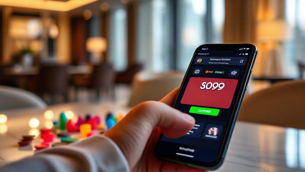
Reading tk999 Without Words: Icons, Colour and What They Communicate
A user can move through much of the tk999 app without reading a single sentence. Tapping a ball icon to reach sports, a chip icon for casino games, or a green button to confirm a deposit requires almost no text at all. That visual fluency feels effortless, but it also hides a trade-off: every icon and colour that replaces a word also removes a layer of explanation that some users still need.
This analysis looks at how tk999 communicates through icons, colour coding and imagery, and what that means for comprehension across a diverse Bangladeshi audience. The goal is not to criticise visual design but to understand exactly what the interface says when it says nothing.
The Icon System: Speed at the Cost of Specificity
Icons are the first language of any betting interface. On tk999, a football, a cricket bat, a playing card and a spinning reel do most of the navigational work. They are fast to recognise, they scale well on small phone screens, and they cross language boundaries in a way that English or Bangla labels cannot. For a platform serving users with varying literacy levels, that is a genuine advantage.
The cost appears when icons are asked to carry meaning they were never designed for. A generic trophy icon might mean live sports, a leaderboard, or a promotions page depending on context. A wallet symbol could point to deposits, withdrawals, or transaction history. Icons excel at category recognition but struggle with action specificity, and that gap widens as the menu grows.
Where icon-only navigation breaks down
The breakdown is most visible in secondary tasks. A user who wants to check the terms of a bonus, verify a withdrawal limit, or understand why a bet was voided cannot rely on pictures alone. These are text-heavy, exception-driven tasks, and an icon-first layout often buries them behind a hamburger menu or a small question-mark badge. The result is a two-speed experience: smooth for browsing, hesitant for resolving.
There is also a cultural layer. Sports imagery is fairly universal in South Asia, but casino iconography is less familiar to users who have never encountered a roulette wheel or a slot machine in person. A reel icon may read as decoration rather than as a game category. Visual metaphors only work when the user already shares the reference, and that assumption deserves scrutiny.
Colour Coding: The Fastest Signal and the Easiest to Misread
Colour is processed faster than either text or shape, which is why betting apps lean on it heavily. tk999 uses colour to separate sports from casino, to highlight live events, and to distinguish primary actions from secondary ones. A saturated accent colour on a button signals “this is the next step”; a muted tone signals “this is optional.” Users learn these codes within minutes, often without being able to articulate them.
The problem is that colour carries meaning only when the mapping is consistent and when the user can perceive it. Red is a useful example. In many interfaces red means danger, error, or a losing position. In a betting context it may also signal a live match, a hot promotion, or simply brand emphasis. When one colour serves several purposes, users default to the most emotionally salient interpretation, which is usually risk.
Consistency, contrast and accessibility
Contrast matters more on mobile screens used outdoors, which is common in Bangladesh. A pale green “confirm” button against a light background can vanish in sunlight, pushing users toward trial and error. Similarly, users with colour-vision differences may not distinguish a green win state from a red loss state if those states rely on hue alone. Adding a shape, an icon, or a short label alongside the colour solves this cheaply.
Consistency is the other half. If the same shade of green confirms a deposit on one screen and indicates a completed withdrawal on another, the code still works because the underlying meaning — success — is shared. If green sometimes means “available” and sometimes means “already used,” the code collapses. Colour coding succeeds when one hue maps to one concept across the entire flow.
Imagery and Motion: Atmosphere Versus Information
Beyond icons and colour, tk999 uses imagery to set tone. Banners showing stadium floodlights, card tables, or celebratory graphics communicate excitement and legitimacy. Motion — a pulsing live badge, a scrolling promotion strip — draws the eye toward time-sensitive content. These elements are persuasive rather than informational, and that distinction matters when judging comprehension.
Atmosphere has real value. A user landing on a plain list of text links may doubt the platform is active or trustworthy. Visual energy signals that other people are using the product right now. But atmosphere can also crowd out clarity. When a promotional banner occupies the top third of a screen, the actual navigation sits lower, and the user has to scroll past persuasion to reach function.
When imagery implies more than it states
Imagery can also imply promises the text does not make. A graphic showing stacks of cash or a rising graph suggests winnings without stating odds, limits, or risk. Visual suggestion is not the same as disclosure, and users who skim images rather than reading terms may form expectations the platform never intended to guarantee. Responsible interfaces pair strong imagery with plain-language context nearby.
Motion deserves a similar caution. Animation attracts attention, but constant movement on a small screen can make it harder to locate a stable tap target. Users in a hurry — the typical mobile betting user — benefit from motion that is purposeful and brief rather than decorative and continuous.
The Gaps This Creates and How to Read Around Them
The visual-first design of tk999 is genuinely efficient for experienced users. Someone who has used the app for a week can navigate to a live cricket market, place a selection, and confirm a deposit almost entirely through pattern recognition. That is the payoff of good iconography and consistent colour.
The gaps appear for new users, for users with lower digital literacy, and for anyone attempting an unusual task. Three practical habits close most of those gaps:
- Read the label under the icon once. Most icons on tk999 carry a short text label; confirming it early prevents later mis-taps.
- Treat colour as a hint, not a fact. Before acting on a red or green element, check the accompanying text for the actual state.
- Slow down on money screens. Deposit, withdrawal and bet-confirmation pages are where visual shorthand is least reliable and where a misread costs the most.
There is also a design lesson here for anyone building similar products. Visual communication should be treated as a first layer, not a replacement for language. The strongest interfaces let icons and colour do the fast work of orientation while keeping short, plain sentences available for confirmation, terms and errors. Accessibility improves when every visual signal has a textual backup within reach.
Reading tk999 without words is possible, and for many users it is the default. The interface rewards familiarity and punishes assumption. Understanding what the icons, colours and imagery actually communicate — and where they stop communicating — is what separates confident navigation from guesswork.